Hello everyone!
I had an art journal
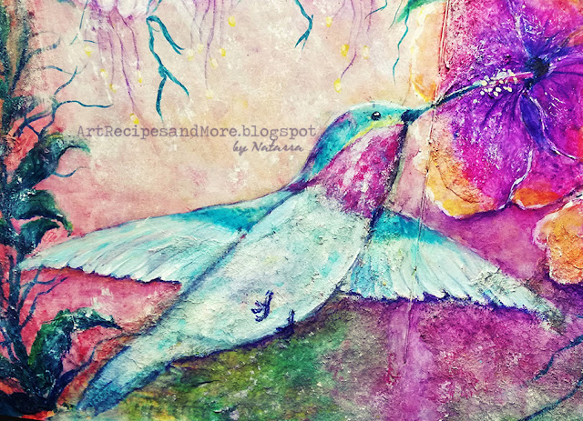
spread (18" x 9.5") painted with a vibrant purple color, leftover from another project. It
reminded me of exotic birds and that was my inspiration for the Humming Bird. I
adore these little creatures, because they are so delicate and beautiful. They are absolutely stunning!
I started spraying,
on top of the purple, with Yellow and White Media Misters, but at some point I realized
that the pages were not gessoed! The colors soaked into the paper and I wasn’t
getting the result I was looking for. I paused and took a step back. And then
the idea came to me.
Since I didn’t
want to cover up everything with gesso and loose that beautiful purple on the background, I took
some used baby wipes that were dry and had so many colors on them. Tore them
into pieces and glued them with Media matte medium, to cover up the areas I
didn’t like, mostly around the edges of the pages. And then I applied with my
fingers a light coat of white gesso to the rest of the page.
After that, I
roughly sketched the bird and some flowers with a soft pencil. I used Media
Translucent White to base coat my figures and then started coloring them. First
the bird, then some leaves and vines to give my painting kind of a border, and
then the flowers.
I worked the
background by dabbing layers of colors with kitchen roll paper. I was using one
that’s thick and heavy duty and it gave me a really nice blending and texture.
For the darker areas of the background, I also used Caran D’ Ache Neocolor II
Watersoluble Pastels.
I took a big flat
brush and lightly brushed with Media Translucent White to give the impression
of sunbeams coming through the flowers and foliage.
When I started
painting these little white flowers, my 4-year-old daughter told me they looked
like Fairies! So, I kept them white with some purple details in order to give
them this airy and whimsical look Fairies are supposed to have.
For the leaves and
vines, I used Media Fluids “Prussian Blue Hue”, “Phthalo Turquoise”, “Cobalt Turquoise
Hue”, “Blue Green Light” and “Primary Yellow”. I varied the color mixtures in
order to get different shades for the foliage.
I painted the
Hibiscus flowers first with Caran D’ Ache Neocolor II Watersoluble Pastels. Then,
I went over with Media Fluids “Primary Magenta”, , “Prussian Blue Hue”, “Phthalo
Turquoise” and “Primary Yellow”, because I wanted to make colors even more
vivid and bright, especially those purple hues.
I really liked the
collage with the baby wipes, because it gave a very natural, organic texture that
matched perfectly with this wild forest scene!
I hope you like it
too!
Thank you for visiting my blog!
Until next time,


No comments:
Post a Comment